Creating a Hoverable Navigation Menu Using HTML and CSS

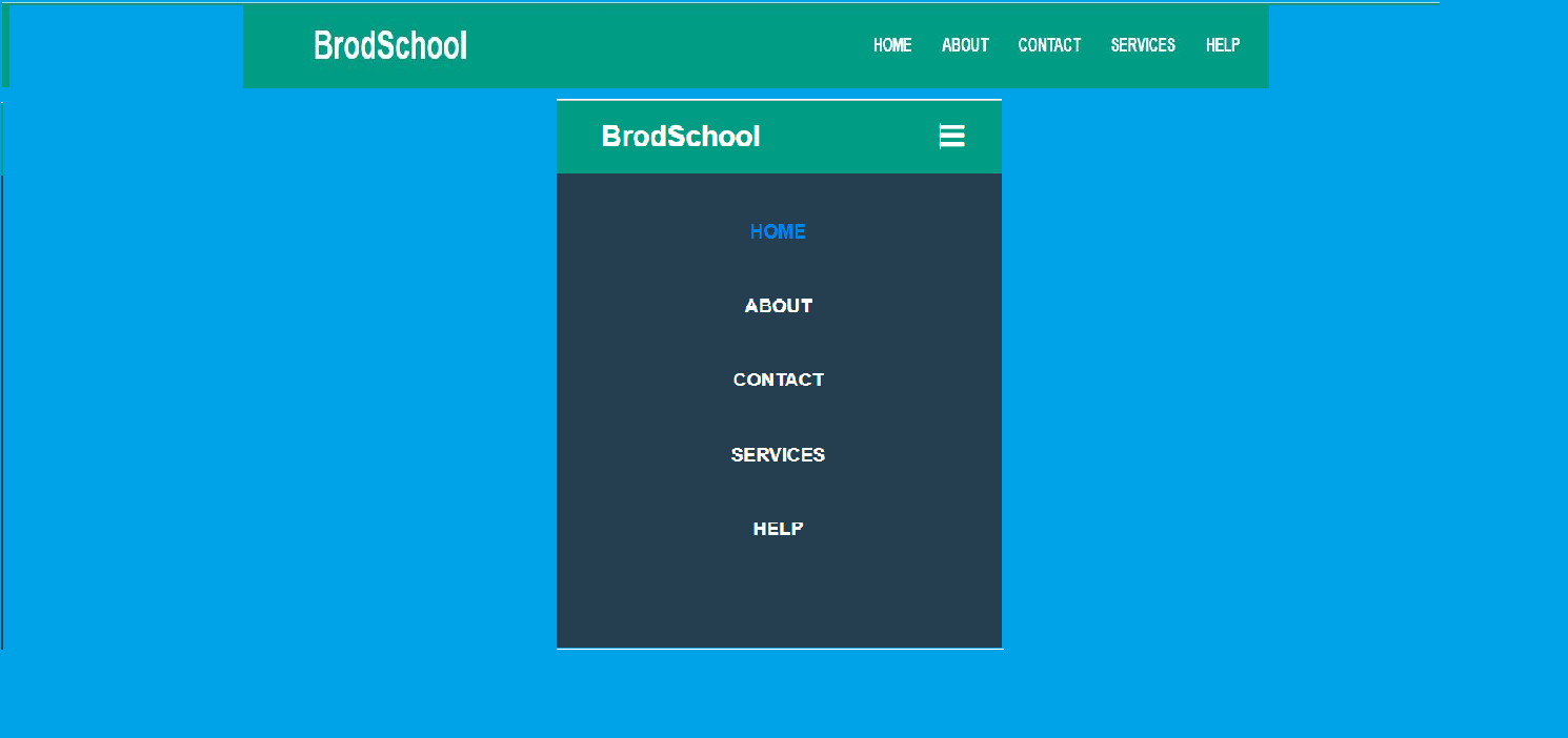
This navigation bar is made responsive using HTML and CSS. As you can see in the image, there is a logo and some navigation links. The responsive part is what you can see below the navigation bar. This is what it looks like when you open it on a small screen device.

If you are a fresher and you want to create a responsive navigation bar with the help of HTML and CSS. So you should try to create this navigation bar. The source code and link of this navigation bar is given below.

Key Points

  1. HTML Structure

  2. Basic Styling

  3. Hover Effects

Other Beautiful Navebar

  1. CSS Styling

  2. Reset Styles : Remove default margins and paddings to start with a clean slate.

    Navebar Styling : Apply a background color to the navigation bar and clear floats to handle layout.

    Menu List Styling : Remove bullets and float list items horizontally.

    Link Styling : Style link to appeare as block element with padding and set text color and alignment.

    Hover Effecct : Change the background color of the link on hover.

Output


output13
HTML
<!DOCTYPE html>
  <html lang="en">
    <head>
      <meta charset="UTF-8">
        <meta name="viewport" content ="width=device-width, initial-scale=1.0">
        <title>Responsive Navbar </title>
          <link rel="stylesheet" href="styles.css"/>
          <link rel="stylesheet" href="https://cdnjs.cloudflare.com/ajax/libs/font-awesome/5.15.3/css/all.min.css"/>
    </head>
  <body>
       <nav >
         <input type="checkbox" id="check">
         <label for="check" class="chekbtn">
            <i class="fas fa-bars"></i>
          </label>
         <label class="logo">BrodSchool</label>
         <ul>
             <li><a class ="active" href="#">Home</a></li>
             <li><a href ="#">About</a></li>
             <li><a href ="#">Contact</a></li>
             <li><a href ="#">Services</a></li>
             <li><a href ="#">Help</a></li>
         </ul>
       </nav>
         <h1>Welcome to our Website </h1>
          <p>This is a sample page of responsive navbar</p>
   </body>
  </html>
CSS
/*default margins and paddings */
   * {
margin: 0;
padding: 0;
text-decoration: none;
list-style: none;
box-sizing: border-box;
   }
   body {
font-family: "Montserrat", sans-serif ;
   }
/*Style the menu items */
   nav {
   background: #0d9b81 ;
   height : 80px ;
   width: 100% ;
    }
   label.logo {
   color : #fff ;
   font-size : 36px ;
   line-height : 80px ;
   padding:0   100px ;
   font-weight :bold ;
   }
   nav ul {
   float: right ;
   margin-right : 20px ;
   }
   nav ul li {
   display: inline-block ;
   line-height : 80px ;
   margin : 0   5px; ;
   }
   nav ul li a {
   color: #fff ;
   font-size : 17px ;
   font-weight : 700 ;
   padding : 7px   13px ;
   border-radius : 3px ;
   text-transform : uppercase ;
   }
/* Change color on hover */
   a:hover
{
   background: #1dbfa2 ;
   transition : .5s ;
   }
   .chekbtn
{
   font-size: 30px ;
   color : #fff ;
   float : right ;
   line-height : 80px ;
   margin-right : 40px ;
   cursor : pointer ;
   display : none ;
   }
   #check {
   display: none ;
}
   @media (max-width: 952px) {
   label.logo {
   font-size: 30px ;
   padding-left: 50px ;
  }
   nav ul li a {
   font-size: 16px ;
  }
}
   @media (max-width: 952px) {
   .chekbtn {
   display: block ;
  }
   ul {
   position: fixed ;
   width: 100% ;
   height: 100vh ;
   background: #2c3e50 ;
   top: 80px ;
   left: -100% ;
   text-align: center ;
   transition: all .5s ;
  }
   nav ul li {
   display: block ;
   line-height : 30px ;
   margin : 50px   0px; ;
   }
   nav ul li a {
   font-size : 20px ;
   }
   a :hover,a.active {
   background: none ;
   color: #0082e6 ;
   }
   #check:checked~ul {
   left : 0px ;
   }
}


BrodSchool

Jagatpur,
Raebareli 229402, UP,  India
Amresh Kumar (Founder)
Phone: +91 9198 26 3500
Email:suportucracker@gmail.com

copyright © 2025 All Right Reserved.