Creating a Responsive Image slider
Hello friend, I hope you are doing great. Today you will learn how to create an Responsive Image Slider using HTML CSS and Javascript.
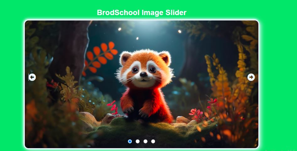
The interesting thing about this slider is that when the user enters
And when you click on Preview or Next button, it automatically changes the image. And when you open it on any device, it adjusts automatically.
Basic Style
- Shape : The shape of this box is a slightly rounded rectangle, giving it a soft and modern look.
- Color : This button uses white backgroun color .
Output
Other
HTML
<!DOCTYPE html>
<html lang="en">
<head>
<meta charset="UTF-8">
<meta name="viewport" content
="width=device-width, initial-scale=1.0">
<title> Image Slider </title>
</head>
<body>
<section>
<div class="button">
<input type="radio"class="button"id="radio1" onclick="changeSlide(0)" >
<input type="radio"class="button" id="radio2"onclick="changeSlide(1)" >
<input type="radio"class="button" id="radio3"onclick="changeSlide(2)" >
<input type="radio"class="button" id="radio4"onclick="changeSlide(3)" >
</div>
<img src="img/p1.jpg"alt="img1" class="slide">
<img src="img/p2.jpg"alt="img2" class="slide">
<img src="img/p3.jpg"alt="img3" class="slide">
</section>
<div class="nav">
<a class="side-button prev"onclick="goPrev()" ><i =class="fa-solid fa-circle-left";</i> ></a>
<a class="side-button next"onclick="goNext()" ><i =class="fa-solid fa-circle-right";</i> ></a>
</body>
</html>
CSS
/*Style the box items */
* {
padding: 0 ;
margin: 0 ;
box-sizing: border-box ;
font-family: sans-serif ;
}
body {
backgroun-color: #6433f9 ;
height: 100vh ;
width: 100vw ;
position: absolute ;
flex-direction: column ;
align-items: center ;
display: flex ;
justify-content: center ;
}
section {
background-color: #4070f4 ;
height :550px; ;
width :70% ;
position :relative ;
overflow :hidden ;
display :flex ;
justify-content: center ;
align-items: center ;
box-shadow : 5px 5px 21px alicebluergba(0, 0, 0, 0.1) ;
box-shadow : 5px solid aliceblue rgba(0, 0, 0, 0.1) ;
border-radius : 21px ;
}
img {
position :absolute ;
transition :1s ;
height :fit-content ;
width :100% ;
}
.nav {
color :blue ;
position :absolute ;
font-size :31px ;
display :flex ;
gap :92px ;
justify-content :space-between ;
}
.buttons {
bottom :20px ;
position :absolute ;
font-size :31px ;
display :flex ;
gap :16px ;
color :blue ;
justify-content :space-between ;
z-index :100 ;
}
input[type= 'radio' ] {
height : 18px ;
width : 18px ;
}
Javascript
/*JavaScript*/
<script>
const slide=document.querySelector('.slide') ;
const radioButton=document.querySelector('.button') ;
var counter=0 ;
slide.forEach (
(slide, index) , ()=>{
slide.style.left = `${index * 100 }%` ;
}
)
const = goNext = ()=>{
counter++ ;
slideImage() ;
}
const = goprev = ()=>{
counter-- ;
slideImage() ;
}
const = slideImage = ()=>{
slide.forEach (
( slide) =>{
counter<= slides.length - 1 ? ;
slide.style.transform = ` translateX(-$ {counter * 100} %)` ;
: counter = slides.length - 1 ;
)
}
const = slideImage = (slideNumber)=>{
counter = slideNumber (
slide.forEach (
( slide) =>{
counter<= slides.length - 1 ? ;
slide.style.transform = ` translateX(-$ {counter * 100} %)` ;
: counter = slides.length - 1 ;
}
}
</script>