HTML
<!DOCTYPE html>
<html lang="en">
<head>
<meta charset="UTF-8">
<meta name="viewport" content
="width=device-width, initial-scale=1.0">
<title>Morden Clock | BrodSchool</title>
</head>
<body>
<div>
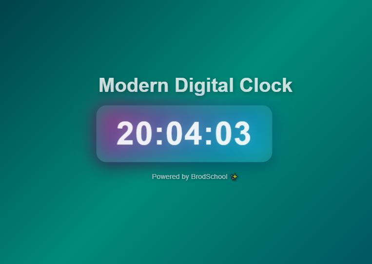
<h1>Modern Digital Clock</h1>
<div id="clock-container">
<div id="clock">00:00:00</div>
</div>
<footer>Powered by Time ✨ BrodSchool</footer>
</div>
</body>
</html>
CSS
/*Style the box items */
* {
padding: 0 ;
margin: 0 ;
box-sizing: border-box ;
font-family: sans-serif ;
}
body{
height: 100vh ;
display: flex ;
overflow: hidden ;
align-items: center ;
background: linear-gradient(135deg, #141e30, #243b55) ;
padding : 20px ;
justify-content : space-between ;
}
h1 {
font-size : 32px ;
text-align : center ;
margin-bottom : 20px ;
color : rgba(255, 255, 255, 0.7) ;
text-shadow : 2px 2px 8px rgba(0, 0, 0, 0.3) ;
}
#clock-container {
display :inline-block ;
text-align :center ;
padding :20px 40px ;
position :relative ;
border-radius :20px ;
background :rgba(255, 255, 255, 0.1) ;
box-shadow :0 8px 32px rgba(0, 0, 0, 0.5) ;
backdrop-filter :blur(10px) ;
animation :pulse 3s infinite ;
}
#clock-container::before {
content :'' ;
position :absolute ;
top :0 ;
left :0 ;
width :100% ;
height :100% ;
background :linear-gradient(135deg, rgba(255, 0, 150, 0.5), rgba(0, 204, 255, 0.5)) ;
border-radius :20px ;
z-index :-1 ;
filter :blur(20px) ;
}
#clock {
font-size :64px ;
font-weight :600 ;
letter-spacing :2px ;
text-shadow :0 0 20px rgba(255, 255, 255, 0.2) ;
color :rgba(255, 255, 255, 0.9) ;
transition : all 0.3s ease-in-out ;
}
#clock:hover {
transform :scale(1.05) ;
text-shadow :0 0 30px rgba(255, 255, 255, 0.5) ;
}
footer {
margin-top :20px ;
font-size :15px ;
color :rgba(255, 255, 255, 0.7) ;
text-shadow :1px 1px 5px rgba(0, 0, 0, 0.5) ;
}
@keyframes pulse {
0%, 100% {
transform :scale(1) ;
}
50% {
transform :scale(1.03) ;
}
}
@media (max-width: 768px) {
h1 {
font-size :32px ;
}
#clock {
transform :45px ;
}
#clock-container {
padding :15px 30px ;
}
}
Javascript
/*Javascript */
function updateClock(){
const now = new Date();
const hours = String(now.getHours()).padStart(2,"0");
const minutes = String(now.getMinutes()).padStart(2,"0");
const seconds = String(now.getSeconds()).padStart(2,"0");
const time = `${hours}:${minutes}:${seconds}` ;
document.getElementById("clock").textContent = time;
}
setInterval(updateClock, 1000);
updateClock();