Creating a Animated Hoverable Button Using HTML & CSS
Hello friend, I hope you are doing great. Today you will learn how to create an animated button using HTML and CSS. The interesting thing in this button is that the user selected button has some advanced features with beautiful UI and UX design.
Basic Style
- Shape : The shape of this button is a slightly rounded rectangle, giving it a soft and modern look.
- Color : This button uses vibrant gradients or soft, pastel solid colors (Ex:- shades of blue, purple, or green). It has a smooth background with slight shadowing to give a subtle 3D effect.
- Text : The text on this button is bold and clear, usually in a contrasting color such as white, ensuring readability. Modern sans-serif fonts are used for aesthetics.
Hover Effects
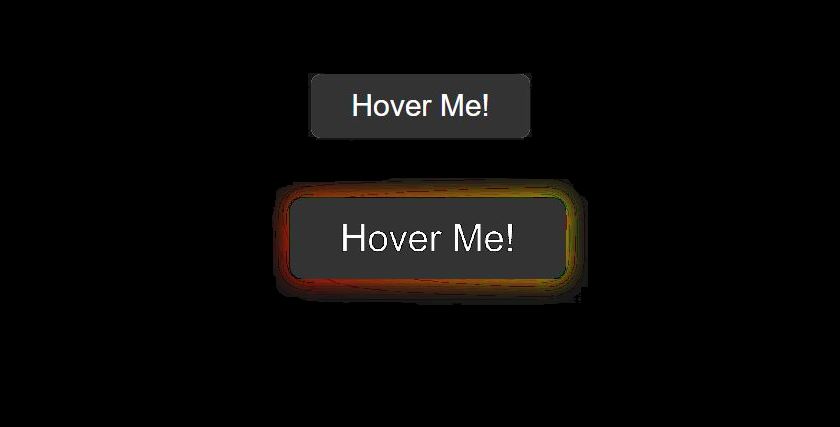
- Color Transition : When you move the mouse over the background, the color changes smoothly, brightening the existing shade (for example, from light blue to dark blue, or from blue to purple). This color change appears as if the button is being "activated."
- Shadow Animation : A soft shadow can intensify or expand when hovered over, giving the button a raised, floating effect, as if it's ready to be clicked.
- Text Color Change : In some cases, moving the mouse changes the background color of the text, such as from white to black, adding nice contrast with the new background.
- Border Glow : When you hover over the mouse, a glowing border will appear, outlining the button in a bright, soft color that matches the design.
Output